

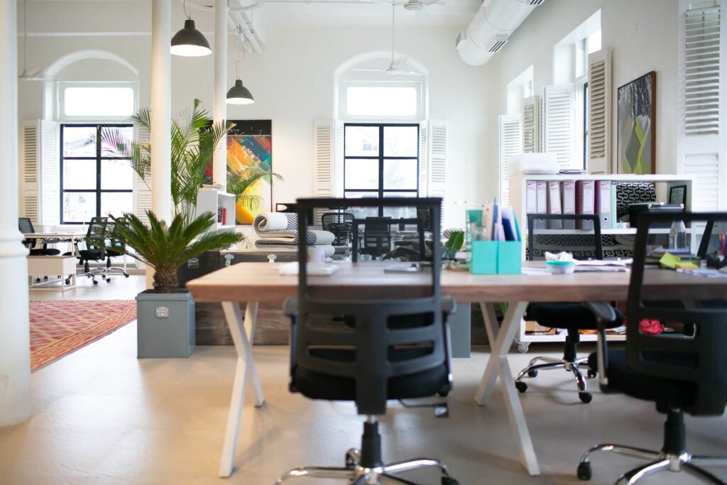
Whether you are working in an office or reinventing your home office interior, explore these trends and designs to inspire you to make the most of your space. The concept of a workplace is constantly changing, especially in the age of evolution we are currently in.
The interiors of office spaces are continuously being reimagined and will keep doing so as the conditions of labor, cultures, and technology evolve in the future.
You don’t have to be an expert in office interiors to appreciate the beauty of a unique and inspired office space. These designs have blurred the lines between work and aesthetic spaces.
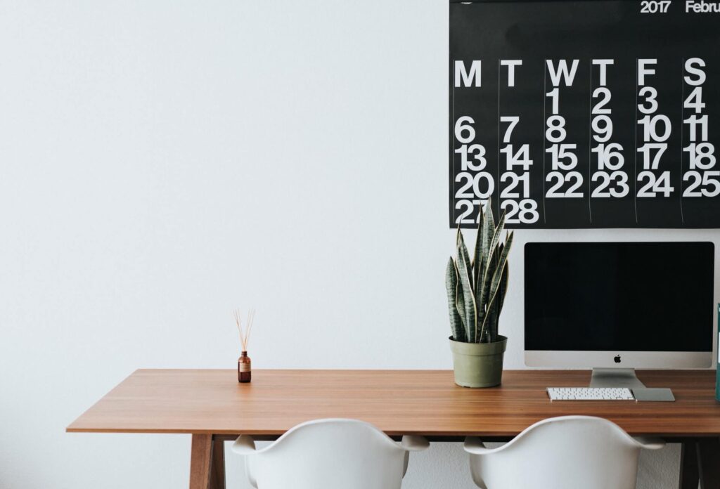
If you are the type of individual who is easily overwhelmed by clutter and contrasting colors ringing loudly in your ears, this style is perfect for you!
Simplicity is vital in a minimalist design. This theme should be carried through from the chairs to the lighting. It’s the details in the interior that will determine if it genuinely adheres to your minimalistic approach.
Avoid flashy objects and unnecessarily bright colors. Instead, stick to a neutral palette with the inclusion of only items that serve a function. The idea is to avoid overstimulating your senses.
When choosing furniture, set your sights on simple designs. A desk with a minimal amount of drawers is preferable. Be sure to match your chair and any additional furniture as closely as possible. We don’t want contrasting themes to interfere with the peaceful flow of minimalism.
Concerning art, stick to simplistic abstract paintings, but be cautious of not creating clutter on the wall you face when working. A small green plant would do a better job adding some color than art would.
To maintain harmony in your home office, organization goes a long way. It may be a challenge to organize your office if you want to keep it as minimalistic as possible, but here are some guidelines that will help you prioritize:
Everything that doesn’t necessarily need to be in your space immediately can be neatly packed away in space-saving furniture. Try to invest in furniture that can close and cover what it incases. A large stack of files is never pleasing to behold. Closing a little cupboard door on it makes all the difference.
You can even take minimalism a step further and invest in a fold-out desk. This way, when your working day is done, you simply fold your office space into the wall. Out of sight, out of mind!
The idea behind the clean and bright office interior concept is that the wall color from the ceiling to the floor is white. This absence of color gives you the freedom to be creative with different accessories and furniture colors.
Color can be incorporated by having a collection of books on a white shelf or vibrant paintings on your white wall.
If it’s a truly clean look you crave, you can stick to keeping everything white.
This also makes for a perfectly calm environment and background when involved in online team meetings.
Designers refer to such office interiors as being minimalist with a twist. It undeniably generates an aerated and open atmosphere. Isn’t that exactly what one wants in a day’s work?
An open window and the wind making the linen curtains dance harmoniously is the perfect addition to your clean and bright office design and house in general.
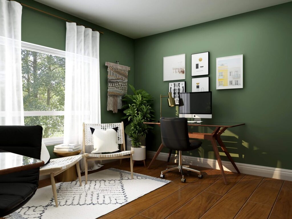
One way to go is to have a statement wall of bright colors such as green or yellow. While still being calming colors, you have created some life and vibrancy sure to keep you excited and engaged throughout your day.
Being your own designer, you can decide on how you want to manage the details of your interior. It is often advised to keep your chairs and tables relatively neutral if the color scheme of your walls or shelves is stealing the spotlight. But if you are one for a darker wood structure, it is advised to keep your accent wall inoffensive. Using colors like navy blue and olive green will suit darker floors and furniture better than neon finishes.
A bold statement can be achieved not only by the color of your walls but also by filling spaces with eccentric details such as a glaring yellow chair or half and half-painted walls.
A sure way to brighten office interiors is with the addition of several plants.
Whether it is hanging pots or a vase of flowers, natural elements are always a sign of a happy environment. This is especially true in parts of the world where the winters are long and grey.
A great way of zoning a space is by painting only a specific section of the wall in a geometric fashion. This feature has become part of a contemporary design in recent years.
This could even be a small DIY project for you as it is so easy to do with just a little masking tape and some complimentary colors. Light blues and greys are very popular, but you do you! Create your own style in your space by diverging from traditional office interiors and making it your own interior design.
Offices generally lack a sense of identity and creativity because work isn’t always associated with these things, but your workspace can be different.
Just like in your house, you are the designer of your office and workspace, and it should be customized to you personally.
Classically stylish wood finishes always seem to add value to an office design which will create a sophisticated renovation of a simple space.
Having a wooden desk, a wooden floor or a wall section lined with wood will convert your workplace into a 1920’s beauty that architects aspire to achieve in new offices. It creates an almost vintage space with all the elegance a workspace interior needs.
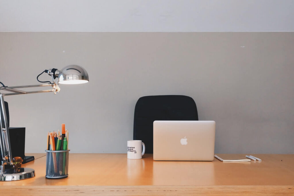
Having an office job usually entails a lot of sitting, leading to problems such as backache and joint health declination.
That’s why it is important to give employees a space where they are able to adjust their surroundings and equipment to avoid feeling confined.
Implementing adjustable chairs, standing desks, and diverse spaces with appropriate functions can go a long way in keeping everybody in the company happy and healthy.
Office interiors may include having allocated spaces for brainstorming and collaboration. This enables employees to stretch out and get some new insight into a project.
A team is only as strong as its weakest member, so it should be on the top of every company’s priority list to ensure that access to freedom is granted to everyone.
How many hours are wasted in offices due to lack of organization?
Implementing smart storage solutions can save so much time, creating the opportunity to focus on work instead of tracking files down in a disorganized office.
An elaborate search causes frustration and dissatisfaction. There are so many shelving options that would amplify the functionality of office interiors.
The average attitude in an office group has changed and gained a voice in the last few decades. Cubicles and confined spaces have definitively proven to lower productivity and the general well-being of workers. People are less concerned about office hierarchy and move invested in having a meaningful role and contribution in offices.
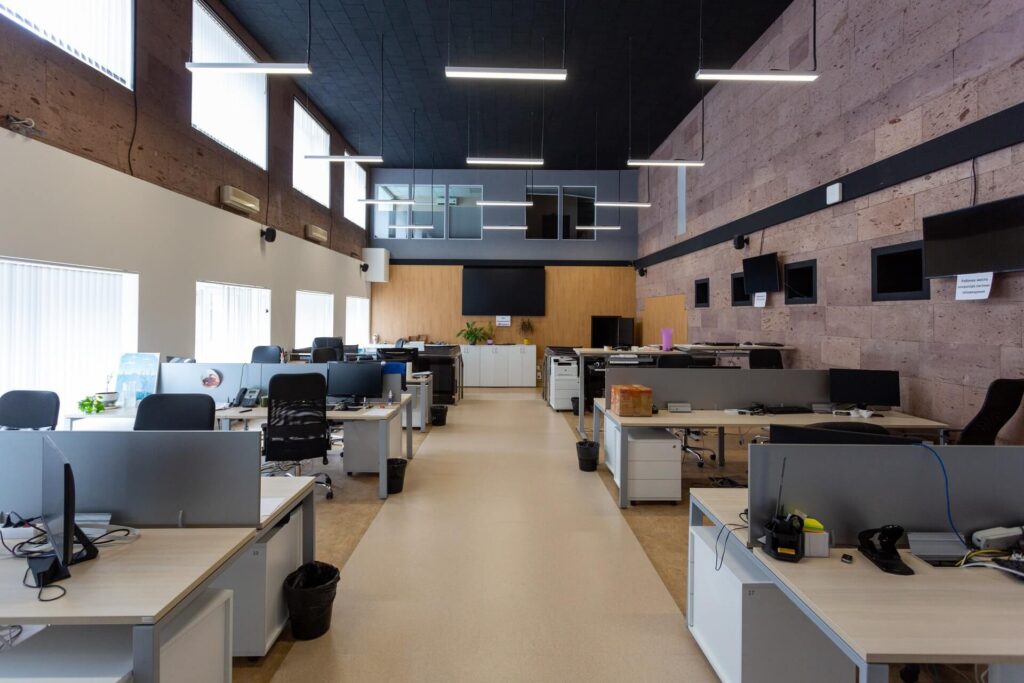
Studies have repeatedly shown that exposure to natural light in offices not only boosts productivity but increases energy levels. Having outside areas on-site where employees can take a walk will lead to health and general merriment in the building.
Distractions such as noise and lack of privacy are common complaints among workers. This can be solved by having little nooks created for the sole purpose of uninterrupted concentration and reflection.
Such areas can be located at various sites around the building, like under the stairs or on window ledges.
The point is for everyone to have a space away from their office desk where they can think.
Such areas are crucial when you want to create an interactive attitude in a team by allocating space in the office purely for the purpose of brainstorming or conversing in search of solutions to problems.
A collaborative space is equivalent to a lounge in a house, where comfort and communication are prioritized. You can incorporate some lounge furniture and natural light to encourage each member of the team to speak freely about recent events or aspirations for the company.

You don’t have to waste time and resources trying to come up with the perfect extravagant color palette for an office. Stick to the basics!
A variation of dark and light greys, creams, and blues will allow you more freedom when it comes to the other elements in the room.
Textures and structure can often ad a lot more versatility to an office than colors can.
Natural light not only benefits the well-being of your employees, it can also save you money in electricity usage in the office.
An abundance of windows and glass features will enhance the interaction of everyone in the company with nature. The light features created today are sure to withstand the test of time in that you will always be able to alter your designs with them still being relevant.
In addition to natural light, being smart in your use of artificial light in the office can also make a massive difference. Combining LED lights and natural light is said to be the most efficient.
Wood is like diamonds, it will never go out of style. Although, the shades may vary with the decades. That is why it is wise to go with a natural tone that will compliment all the other elements in the office.
Not only is wood aesthetically pleasing, but it is also extremely durable en resilient, making it a good long-term investment.
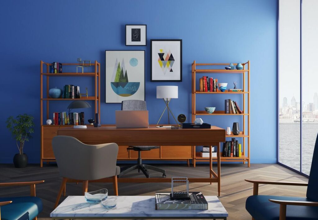
Art and architecture go hand in hand in giving a building as well as a house a completed and finished look.
It doesn’t have to be worth millions to add value to your office interior. Generally located in the central areas of the building, the choice of artworks says a lot about a company.
It is also proven to affect employees in a very positive way by inspiring creativity and reducing stress.

Google offices and headquarters are designed to be wildly alternative with the purpose of inspiring creativity. With a wide diversity of on-site physical activities and snack bars, Google believes that these carefully analyzed concepts encourage employees to be very interactive and open toward exploring new ideas.
The open plans and the abundance of common areas encourage collaborative collisions. Although the exterior architecture of Google’s building may seem insignificant, architects definitely went out of their way to make the interior site a picture to behold.
Tokyo architecture really got it right with their incredible interior design for this co-working space. The theme being Pangea, architects were in search of realizing the concept of people from different cultures and backgrounds coming together as one, just as Pangea was once a whole.
The headquarters of this building is completed with an alternative design of huge ribbons of wood providing desk surfaces. The curved nature of the furnishing was perfected by architects and designers to create a feeling of harmony and deconfinement that truly sets this company’s space.
ConForm architects strove to design a building that feels more like a house. These architects completed a homely office for this financial institution in the city of London with the goal of creating diverse spaces with diverse functions.
The floor plan is collectively open with views of the surrounding city. The space is split into zones of respective functions. Some have strong ties to domestic architecture, encouraging employees to feel relaxed and at home, considering their relatively stressful roles in the company.
Natural tones and soft textures are central to this design.
